
motion / design
Give motion a job to do.
Movement can explain, guide and add character. The strongest starting point is deciding what a viewer should understand because something moved.
Bondfire Editorial · · 3 min read
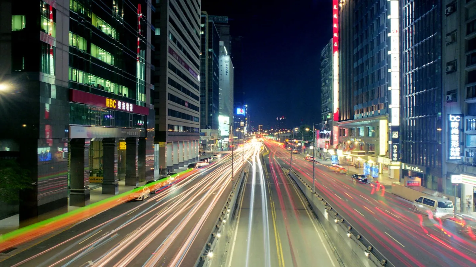
A moving element immediately asks for attention. That makes motion a useful design tool, but also a decision with consequences. If everything moves, the viewer has to work out which movement matters.
Before building a sequence, finish this sentence: “This moves so that the viewer understands…” The answer might be a change of state, the order of a story or the character of a brand. If the answer is simply that movement looks impressive, the idea needs another pass.
Choose one main moment
A launch film and a contact form ask different things of their audience. The film may invite someone to watch a story unfold. The form needs to help someone complete a task. Treating both as stages for the same choreography can make the quieter task feel unnecessarily demanding.
Sketch the sequence as still frames first. Identify where the viewer should look in each frame. Then use motion to connect those decisions. This keeps the sequence attached to a message rather than a collection of techniques.
Keep the content available
For a website, decide what someone should see before an animation begins and after it finishes. Headings and actions need to remain understandable. A visitor should not have to replay a sequence to find a useful piece of information.
Be especially careful with scroll-controlled scenes. Consider how much scrolling is required to reach the next section on a phone. Preview the complete journey rather than reviewing the scene in isolation at a designer’s preferred screen size.
Plan a quieter version
W3C’s guidance on animation from interactions explains why non-essential motion triggered by interaction should be disableable. Large movements can be uncomfortable for some people. A reduced-motion preference is a meaningful design input, not an afterthought.
Design the still or simplified version alongside the moving one. Preserve the message, the hierarchy and the available actions. Removing an effect should not remove the content that the effect was supposed to explain.
Review timing in context
Watch the sequence with the actual text and images, then try it during an ordinary task. Can someone read the sentence before it changes? Is the ending clear? Does repeated movement distract from a nearby paragraph?
Ask a person unfamiliar with the design what they understood. Their description is often more useful than whether they say the animation looks good.
Know where to stop
A single purposeful transition can establish character. The next section may need only space and a strong heading. Leave room for stillness so the important movement has somewhere to stand out. The goal is an understandable experience with a point of view, not a count of animated elements.